Branding: szabi.space
Summary /
This project started from Szabi's desire to reorganize his personal brand and launch a concept that, in the future, could be transformed into a standalone company. We began this journey aiming to define not just a visual identity, but a strategic structure meant to support his long-term vision and professional ambitions.
Brand strategy and creative direction
As always, our strategic journey began with an in-depth audit. We went through the stages we usually outline on our website: we conducted 1:1 interviews with Szabi and his peers, gave him homeworks, we studied his competitors and sought to find a positioning that harmoniously encompassed all the essential aspects.
The goal was to unite his values (balanced, principled, efficient, sophisticated), his objectives (such as the freedom to choose projects and the desire for his business life to fuel his personal life), his core services (designing, developing, and implementing complex software systems), and his personal story.
From all these conversations, a story from his childhood stood out immensely: the one where Szabi would sit in the middle of his room and use toys to create an entire city around him, complete with all the essential services. As a child, he didn't just play; he built systems and infrastructure.
This memory provided us with the perfect metaphor for how he approaches software engineering today. We used this foundation to build the brand concept around the idea of the "City-Code Manager-Maker" a digital urbanist who designs the high-level systems required for a product to scale.
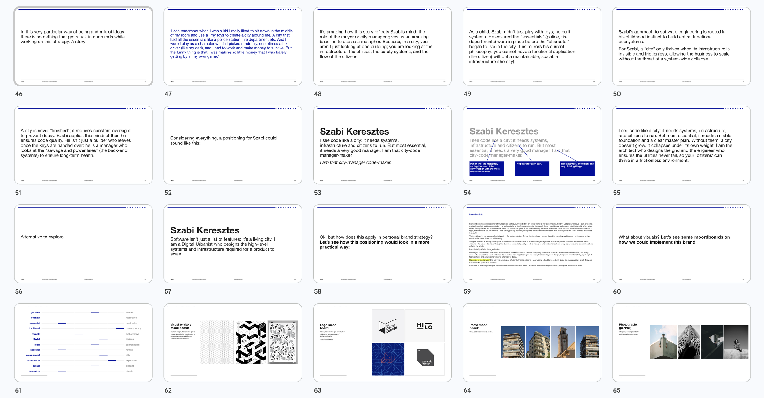
As a child, Szabi didn't just play with toys; he built systems. He ensured the "essentials" (police, fire departments) were in place before the "character" began to live in the city. This mirrors his current philosophy: you cannot have a functional application (the citizen) without a maintainable, scalable infrastructure (the city).
Szabi’s approach to software engineering is rooted in his childhood instinct to build entire, functional ecosystems.
For Szabi, a "city" only thrives when its infrastructure is invisible and frictionless, allowing the business to scale without the threat of a system-wide collapse.
A city is never "finished"; it requires constant oversight to prevent decay. Szabi applies this mindset then he ensures code quality. He isn't just a builder who leaves once the keys are handed over; he is a manager who looks at the "sewage and power lines" (the back-end systems) to ensure long-term health.
That’s why the brand promise fits:
I see code like a city: it needs systems, infrastructure, and citizens to run. But most essential, it needs a stable foundation and a clear master plan. Without them, a city doesn't grow. It collapses under its own weight. I am the architect who designs the grid and the engineer who ensures the utilities never fail, so your 'citizens' can thrive in a frictionless environment.
Visual system & identity
When we moved into the visual territory, we realized it would be best to use an element specific to "urban" design and planning: the isometric grid. In urban design, this grid is the starting point for any city plan, representing order, scalability, and three-dimensional thinking. Starting from this isometric model and the sense of three-dimensionality it creates, we built both the visual territory and the logo - which takes on a minimalist direction while maintaining a three-dimensional suggestion.
We made these decisions to continue the narrative of "Planning" and to carry forward the strategic line of his positioning. Practically, we managed to check off all the elements that make a brand successful: a strong positioning, subtly connected to the visuals, perfectly integrated into the entire brand universe, and communicated in a way that achieves overall coherence. The result is a solid and memorable system that can be sustainably built upon over time.
Testimonial
Cami Gui, Clujul Sustenabil:
For me, this process was a complex and challenging one, because it placed an honest mirror in front of our organisation at a critical moment in its becoming. Beyond being an invitation to sincere reflection, it was also an encouragement to finally activate our true potential on all fronts.
Throughout the work with Alexandra and David, we became more selective about what we truly want from our NGO; once the new visual identity was created, it made me personally pay proper attention to curating and communicating everything we develop in our projects.
In addition to their professionalism and their creative, psychology-infused and eclectic working methods, I am grateful to the BEAM team for fuelling and structuring initiatives we had needed for a long time. I sincerely believe that thanks to this new identity, our NGO work will finally be showcased and presented to the world in a clear and meaningful manner, unlocking hidden energies and enabling new partnerships for our ecosystem. It was comforting and also rewarding working with BEAM and starting off a new chapter of our passionate civic work.
Team and thanks
We are grateful to have been part of this branding process of Clujul Sustenabil.
Strategy & creative direction: Alexandra Crăciun
Design: Iulian Tărnăuceanu
Client: Szabi Keresztes